Rams's second principle of good design is that it makes a product useful:
'A product is bought to be used. It has to satisfy certain criteria, not only functional, but also psychological and aesthetic. Good design emphasises the usefulness of a product whilst disregarding anything that could possibly detract from it.'
'Usefulness' is, in a sense, too simple a term to capture the nuance of use; it is a term from another age. It cannot hope to imply the multiple interests now at stake in a piece of design. Branding has, in many ways, replaced usefulness as a criterion for successful design. The values or emotions created by a design are now more important than their utility.
 Sneakers are a prime example. What is the best sneaker? The one that is most comfortable? The one that is best for your feet? The most durable or weather-resistant? All of these questions are beside the point of sneaker design.
The best sneaker is the most desirable, gives a positive branding to the wearer. The usefulness of the sneaker comes from its ability to reflect consumer identity. This usefulness is not necessarily in the best interest of the consumer; although it is certainly in the interest of sneaker manufacturers.
Much design is, in fact useless. It is neither integral to the product nor does it enhance it in any tangible way, but rather furthers the product's brand in some way. This is the molding of emotional content, but it is far away from what we think of as design, where form serves function.
The first of Dieter Rams's Ten Commandments of Design is that good design should be innovative.
'The possibilities for innovation are not, by any means, exhausted. Technological development is always offering new opportunities for innovative design. But innovative design always develops in tandem with innovative technology, and can never be an end in itself.'
Innovation has become a very trendy word, thrown about with abandon, by politicians and business people. It has the advantage of not meaning anything particular, but having a kind of 'you-know-it-when-you-see-it' connotation of freshness and novelty. It's cultural, it's technological and it's about contexts: how and when we do what we do.
It is interesting that Rams makes an assertion of the necessity of innovation alongside a caveat to it. In his book The Craftsman, Richard Sennett quotes Robert Oppenheimer's diary:
'When you see something that is technically sweet, you go ahead and do it and you argue about what to do about it only after you have had your technical success. That is the way it was with the atom bomb.'
In a nutshell, this describes the problem of innovation. What and how one does something are surely subservient to why one does it. It is quite possible to be innovative without having any imagination. Making something without knowing why is not necessarily a recipe for innovation. Not every idea is a good one.
I am currently watching a television series called The Genius of Design on BBC 2. I happen to have done a little graphic design, when I lived in London, and it is a subject I find compelling.
Design is ubiquitous in modern life and indeed human life. (In a sense, all human action ids) A big part of my interest in Comics and Animation centres on the role design plays in how (and whether or not) they work.
 Genius of Design focusses on Industrial Design, but I believe that the processes and motivations of design transcend their fields of practice. One of the designers featured on the first programme was Dieter Rams, a German industrial designer whose designs for Braun in the 1960s and '70s are considered iconic.
'Back in the early 1980s, Dieter Rams was becoming increasingly concerned by the state of the world around him – “an impenetrable confusion of forms, colours and noises.” Aware that he was a significant contributor to that world, he asked himself an important question: is my design good design?'
This, then, is the first of a short series of blog posts musing on design, through the lens of Rams's Ten Commandments of Design:
- Good design is innovative
- Good design makes a product useful
- Good design is aesthetic
- Good design makes a product understandable
- Good design is unobtrusive
- Good design is honest
- Good design is long lasting
- Good design is thorough down to the last detail
- Good design is environmentally friendly
- Good design is as little design as possible

Paul Grist is certainly best known for his self-published ground-breaking police-procedural, Kane, and for his homage to the superhero genre, Jack Staff. With his new comic, The Eternal Warrior, Grist brings his minimalist graphic style online. OK Erok conducted a Q&A with Paul about how his visual style has developed.
Your layout seems very spacious compared to conventional comics layout. For example, there are only three ‘panels’ in some of your Eternal Warrior (and Kane) pages. You've said before that you were influenced by Frank Miller's Daredevil, in terms of storytelling and structure. Can you elaborate on this and your 'philosophy' of storytelling?
“The storytelling in The Eternal Warrior is different to what I've done in previous comics (Kane and Jack Staff), where I've tended to use the page as a single unit. With Eternal Warrior I'm trying to speed up the production process and I'm using double pages as a single unit, so what I might have got on a single page previously, is spread over two. This gives more space to the layouts.
 What I'm doing is trying to get away from a traditional approach to the comic page - so not using the usual panel boxes, but trying to let the pictures define the shape and layout on the page. It's a different way of working - and I think a different way of reading - to what I've done before, which I think is in keeping with the type of story I’m telling.
I'm trying to do something that is very much a comic, where words and visuals work together. The page with the silhouette and the legend of Leonard - which is not something I've really done before - will be the approach I take for The Eternal Warrior. It's a different to what I'm doing with Jack Staff, which is different to what I did with Kane.”
In looking at contemporary comics, your work is very distinctive. Do you consider yourself a stylist, in any sense? How do you place style, in terms of importance? Do you think there any kinds of comics that you could not/would not adapt to?
“Each story needs a different approach. I think my ‘style’ is distinctive, without being the same regardless of the story. I'm trying to work my way through different story genres - humour, crime, superhero and now fantasy (for want of a better word) - eventually I'll find something I'm good at!”
Do you undergo a long creative gestation period before you start work or do you feel your way into a story as you write/draw it? How did the idea for the Eternal Warrior come about?
“I have had the idea of doing a Big Cosmic Comic rolling round my head for a while now. I did some pages, left them for a few weeks, then came back and redid them - basically I was just running on the spot! - but posting the pages forces me to move forward.”
In terms of your process, as a cartoonist, you seem to place emphasis on speed. Why is this? Has your process changed - or do you see it changing (through technological or any other means) - so that you can work faster? Can you describe your creative process from a to z, in terms of composing pages and pacing stories?
“The speed thing is just a discipline - ideally I would like to be doing something like The Eternal Warrior as a bimonthly companion title to Jack Staff - but I need to prove to myself that I can do it.”
The composition/pacing, as well as the writing, is all done on the page - it's all part of the same thing, after all - which I think is the best way to go for a writer/artist. I don't write a script which I then draw - as the artist I wouldn't want to tie myself down like that.
Usually I start with an idea - perhaps an image or a scene - which I then draw/script. As I work I think how about how this scenario could develop and a story evolves. One way to describe it would be ‘organic’; another way would be ‘chaotic!’
Working like this led to occasions (on Kane and Jack Staff) when what I thought was going to be the beginning of a story became the end, so I worked backwards to reach my starting point! The Eternal Warrior is more linear than Jack Staff and Kane - so I’m not that disorganised, yet! - but I'm only seven pages into it. There's plenty of time!
It works for me, but I wouldn't advise it for anyone else.”
How do you feel about self-publishing nowadays? Do you see it as a necessary evil or a creative choice? The advent of print-on-demand and the internet have lowered the barrier to self-publishing. And there seems to be a natural flow from webcomics to paperback collections. Do you see yourself publishing an Eternal Warrior trade paperback, for example, at the end of its run or will you seek a publisher for it? Have you come across any self-published comics in recent years that have really impressed you?
“I do plan on printing The Eternal Warrior at some point - either as a back-up strip in Jack Staff or as a comic in it's own right - but the facebook group/blog is more an exercise to get me to actually finish pages, rather than coming back to them periodically and starting over!
The internet and print-on-demand allow you to get your work seen, but to make money from it you have to work with the comics distribution set up. The distribution system, for all its faults, allows people to publish their own work and (because it is based on firm sales) know before printing how much (if any) money they will make, so it's a fairly low risk financial proposition.
I don't think self-publishing is as easy as it was a few years ago - there are more hoops to jump through with Diamond - but I still see it as a viable option to being published by a 'proper' publisher.
Favourite self-published titles at the moment are Glamourpuss by Dave Sim and Rasl by Jeff Smith, but they're not the newest kids on the block!”
Is it necessary to be a good draughtsman to be a good cartoonist? I’m not sure. Graphic style (pen, brush, digital and stroke) and draughtsmanship (perspective technique and design) effect storytelling in Comics in a way that is unique to the medium.
I believe that concept and plot are related by observation of realistic drawing rules (ie. perspective, depth cues and foreshortening); emotion and character by expressive line (and/or colour) (ie. emanatae, abstract visual elements).
 In the little treatise-cum- instruction supplement to the last issue of Comic Art, Cartooning: Philosophy and Practice, Ivan Brunetti says that the minimum job of cartooning is to convey the visual characteristics necessary for us to recognise drawings as symbols.
Brunetti illustrates - see what I did there? - with an exercise in which one draws several everyday subjects (a car, a cat, a castle, yourself) a number of times, in successively shorter periods (2 minutes, 1 minute, 30 seconds, etc.), forcing one to strip down images to their essential elements.
As Brunetti says:
“...When we really have too little time to ‘think’ about the drawing we get closer to the ‘idea’ or essence of the thing being drawn. Here we begin to see the universal, latent, symbolic, visual, mnemonic language that is comics.”
Brunetti argues that the goal of cartooning is to reach a compromise between the drawing that satisfies its fictional requirements to occupy space in the visual world of the comic and its function as a symbolic element of the story (ie. the drawing must ‘feel’ physically solid and be ‘readable’ as a symbol).
Jessica Abel and Matt Madden seem to agree. The first exercise they set in Drawing Words & Writing Pictures suggests that one tries drawing stick men. I think cartooning owes a lot more to the discipline of design than is commonly acknowledged and that, in many senses, comics stand or fall on this strength.
Is it necessary to be a good draughtsman to be a good cartoonist? No, it's not necessary, but to be a good cartoonist without being a good draughtsman requires exceptional storytelling. A reasonable storyteller with strong drawing skills is unlimited in terms of storytelling. Lots of amateur cartoonists fail because they want to tell stories beyond their drawing ability.
It’s perfectly valid to criticise comics on the basis of their art; perhaps it is the most valid basis for criticism. As Dez Skinn writes in the introduction to Comic Art Now, comics are and have always been about the artwork.
 My friend Conor has invited me to play bass on his Alien Items project.
Alien Items takes its name (and some inspiration) from a computer game called Elite, that we played as kids. I'm pretty excited about it, for all sorts of reasons.
Elite was a space trading game in which players would fly from galaxy to galaxy trading commodities, dog-fighting with pirates, improving their spaceships and undertaking dangerous missions.
I would describe Conor's music as a kind of melancholy soundtrack to the vast, empty reaches traversed by the lonely space-farer; or to adapt a title from Philip Glass, 'music for space-stations.' I hope you may hear it for yourself in due course.
Simple and compelling, Elite also had a striking aesthetic of wireframe spaceships and planets that was elegant and immersive at a time when 3D gaming didn’t really exist.
 I’ve always loved wireframe models - probably because of Elite - so I have designed a font (also called Alien Items) that echoes the Elite aesthetic and the sparse sound of Conor's music, to use on the project's future releases.
Anyone interested in playing the game can download Chris Pinder's Elite - The New Kind (PC) here.
 Just read this interesting interview with Ridley Scott, from last October's Wired, in which he talks about the influence of Blade Runner on design and particularly architecture.
I think of Ridley Scott as a kind of cinematic designer - dispassionate, cool, technical (he came from an advertising background) - and that seems justified by many of his early films.
Syd Mead was the concept designer and 'visual futurist' who created a lot of the famous vehicles and street scenes for Blade Runner, Aliens and many other films and computer games.
 Mead is more or less credited with inventing contemporary concept design and influencing everybody from Katsuhiro Otomo (Akira) to, well, everybody. For example, Imagine FX did a big feature about Syd Mead last month, with workshops about how to create a Mead/ Blade Runner-esque scene in Photoshop and so on.
Of the aesthetic in Blade Runner, Mead has said:
"We called the whole look 'retro deco.' What I did in my imagination was to mash together every architectural style I could think of. So, I violated architectural motif, and it's funny because architects love that film. Maybe it's cathartic for them."
"Because it's a wholly fabricated world, and the typical thing to do would have been to give it one style. Again, the point is, when you go into the future, you don't start from zero, you take everything along with you. You have to have old stuff to overlay the new stuff. And that's part of what gives "Blade Runner" it's unusual look."
While I love Mead's drawing, with its profuse detail and interest - and his Blade Runner paintings, which evoke the atmosphere evident in the film - most of his gouache painting is pretty awful; lurid, 1960s, Sci-Fi confectionary, full of bubble furniture and naked people wandering about (as you do in the future).
Although Mead's Blade Runner design is exceptional, it has also been given exceptional prominence in his work.
 Now here's how to use a notebook!
I've been keeping a notebook of thoughts, sketches and doodles for a long time. I see my notebook as a dump for everything jangling around the noggin.
However, graphic designer and illustrator Jean Jullien takes the notebook to a new level, with his beautifully drawn and coloured pages.
He uses a moleskine - as do I (and all the best types) - and tints his drawings with watercolour. There's a whole community dedicated to using and adapting moleskines in all sorts of weird and wonderful ways. It's a little frightening, to be honest.
Also check out Jean's wonderful graphic design, bursting with bright colours, paper cutouts and hand-drawn lettering.
Nous avancons!
[via Computer Arts]
 Grab a pencil/ pen/ stylus! It's Drawing Day 2008!
Celebrate by using any of these six free design/illustration/image editing tools online (and off):
- The Gimp - and for those who can't imagine using anything other than Photoshop, there's GimpShop, which adapts the Photoshop interface and hotkeys for Gimp!
- Inkscape - powerful-looking vector graphics editor, with plenty of support material; I'm just started to use this, since my ancient copy of Illustrator seems to be dying. But Microugly has created a handy Inkscape reference for Illustrator heads.
- Paint.Net - I haven't tried this one yet, but it comes highly recommended.
- Fontforge - The only free font editor I've come across. Looks good, if a little awkward to install, for non-techie types.
- Pencil! - unlimited undos with the use of an eraser!
- Pen! - there truly is nothing that cannot be done with a biro.
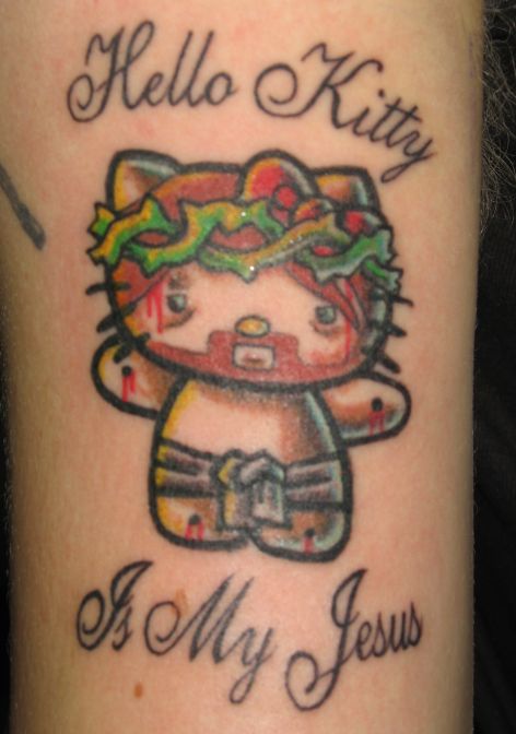 If I overstated the wrongess of designer vinyl toys, words cannot describe with sufficient vehemence the absolute wrongness of this tattoo.
I am struggling to identify who this image might not offend /horrify (apart from the bearer, of course).
 Surely one of the strangest cultural products of capitalism - and one of the strangest subcultures of design - is decorative vinyl toys and character design.
A generation of kids grew up playing with Star Wars figures and watching cartoons and learned to express themselves in these media.
(By the by, this generation - of which I am a member - exhibits something like a traumatic revisiting of childhood, neurotically replaying the popular culture of its childhood years over and over. Perhaps this is because it is the last moment of a truly mass culture.)
Marxist geographer David Harvey talks about capitalism's need to expand into new territory in order to keep keep monetary value from stagnating and deteriorating. Vinyl toys are a bit like that.

What better way to eat up value than to fix it in a toy? They are purely aesthetic items, to be looked at (and maybe collected); they're not really meant to be played with and can be 'adult' in theme.
A broken, aged or non-mint vinyl toy is worthless. Design, by nature is ephemeral and quickly recycled, so actually the value that is fixed in these toys is not just eaten up, not just embodied, it is destroyed.
There is something hateful about the vinyl toy fetish. It is juvenile, self-indulgent and wasteful and yet nothing symbolises our cultural moment like it. In a way it is the avant garde of popular culture: design for design's sake.
 While researching some logo ideas for Apeworks, I came across some logos by a US illustrative designer called Von Glitschka on his blog.
We are so totally immersed in branding, that we now take logos for granted. But for every Apple apple and Nike swoosh there are hundreds (nay thousands!) of lesser lights vying for our attention, from the street to the internet.
Most are not great, but some are brilliant. A good logo is kind of like a little visual puzzle, just missing one piece that the viewer possesses. This may sound a little over the top, but guess what Glitschka's logo (right) is for? You'll get a little buzz of satisfaction when you get it right. It seems like the simplest thing, but of course it's meant to. That's good design.
Glitschka had no fewer than 39 published in this year's edition of The Logo Lounge (the bible of logo design), which tells you he knows something about logos. He also podcasts and posts tutorials about the illustrative design, which tells you he cares about design and giving something back to the community. Kudos for both.
 Working in a library, I know firsthand the excitement, romance and imperilment that can occur at the issue desk and in the stacks.
Why isn't there more fiction set in the noisy, dramatic confines of the library?
Julia Weist's novel about a sophisticated New York Librarian who moves to a small town in the American Midwest to discover life, liberty and happiness is published by writer, lecturer and designer Ellen Lupton, and designed by one of her students.
Lupton, who publishes usually writes about design, is soon to publish a book about self-publishing and book design.
The advent of publish on demand services like Lulu.com makes self-publishing a much better prospect than it was in the past for many writers and small publishers.
Self-publishers just need to make sure they get good design for their book covers.
 Check out my new, massive header! Unfortunately, in resizing, it's gone a bit fuzzy. I'll sort it out for tomorrow.
I'm hoping to get my hands on Tristan Manco's amazing new book about grafitti artists' sketchbooks. I produced a zine of street art in Stockholm a couple of years ago and I love taking photos of cool pieces I see on my travels.
I'm into doodling (a la Jon Burgerman), grafitti, 2D design, comics and illustration in general, so I hope to reflect that here on the site, by reworking the design of the site and posting a lot more drawings over the coming weeks.
Any thoughts or suggestions are welcome. Please drop a line in the comment box.
 Surely one of the weirdest cultural products of capitalism is character design and vinyl toys, collectible decorative plastic figurines.
Marxist Geographer, David Harvey, proposes that capital must expand to new territories in order to 'fix' capital and maintain value.
Money has to go somewhere or it stagnates and deteriorates in value. What better way to eat up some value than by putting it in a toy? A toy can't be used for anything else - and these are not even meant to be played with - and design usually has a fairly short lifespan, so that value is actually eaten up and destroyed.
A generation of kids in the West grew up playing with Star Wars figures and watching cartoons. They communicated through that idiom, sothat instead of making art or pottery, they designed toys and characters.
As more and more areas of life have fallen under the ambit of design - which itself is a sales tool - the more design has become an end in itself. In a way I think the vinyl toy fetish is revolting. Nothing could be more wasteful or self-indulgent and yet it is kind of the avant garde of popular culture and nothing expresses our cultural perspective like it.
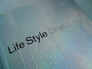 Ha! The title of this post sounds like a pulp adventure novel!
This Saturday, in the course of a mammoth shopping trip - the kind I never do - I went into Chapters book shop and bought Bruce Mau's Life Style. Although I am a biblophile (bordering on biblioholic) I did trade in about six old books - half the price of the new book - which, incidentally, was on sale. Woo!
Anyway...
During some random research I had read Bruce Mau's incomplete manifesto for growth and been impressed. It's published in Life Style, along with a lot of other interesting thoughts and images from Bruce Mau Design. Here's a taste of the manifesto, but I strongly recommend reading the whole thing:"1. Allow events to change you.
You have to be willing to grow. Growth is different from something that happens to you. You produce it. You live it. The prerequisites for growth: the openness to experience events and the willingness to be changed by them.
2. Forget about good.
Good is a known quantity. Good is what we all agree on. Growth is not necessarily good. Growth is an exploration of unlit recesses that may or may not yield to our research. As long as you stick to good you'll never have real growth.
3. Process is more important than outcome.
When the outcome drives the process we will only ever go to where we've already been. If process drives outcome we may not know where we’re going, but we will know we want to be there.
4. Love your experiments (as you would an ugly child).
Joy is the engine of growth. Exploit the liberty in casting your work as beautiful experiments, iterations, attempts, trials, and errors. Take the long view and allow yourself the fun of failure every day.
5. Go deep.
The deeper you go the more likely you will discover something of value.
6. Capture accidents.
The wrong answer is the right answer in search of a different question. Collect wrong answers as part of the process. Ask different questions.
7. Study.
A studio is a place of study. Use the necessity of production as an excuse to study. Everyone will benefit.
8. Drift.
Allow yourself to wander aimlessly. Explore adjacencies. Lack judgment. Postpone criticism.
9. Begin anywhere.
John Cage tells us that not knowing where to begin is a common form of paralysis. His advice: begin anywhere.
10. Everyone is a leader.
Growth happens. Whenever it does, allow it to emerge. Learn to follow when it makes sense. Let anyone lead."
There is a point to this anecdote. Coming across the book seemed to be one of those happy coincidences when the Universe fulfils a deep wish. Firstly, seeing the "process is more important than outcome" point above - which has recently become my unofficial motto - sort of reminded me that I'm on the right track.

 Sneakers are a prime example. What is the best sneaker? The one that is most comfortable? The one that is best for your feet? The most durable or weather-resistant? All of these questions are beside the point of sneaker design.


